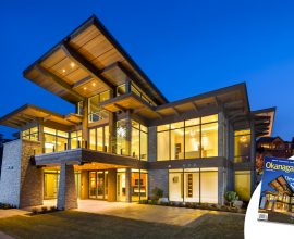
Clean modern design doesn’t have to feel cold
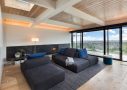
This warm and inviting home has white walls that divide the matching wood floors and ceiling. Opposite what one might think when they hear modern, this home is surprisingly inviting and cozy. So who says clean modern design has to feel cold!
Clean Modern Design for a Comfortable Space
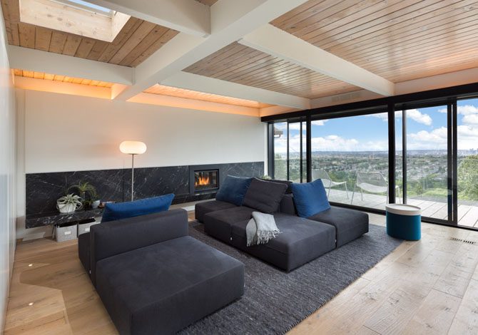
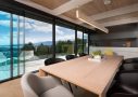
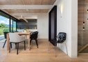
The first thing you will notice when walking through this home is the large panoramic glass wall. It literally opens up from one side of the home to the other. As a result the feeling you get with the view of downtown Vancouver almost spilling into the home is breathtaking. Thankfully it is situated far enough away from downtown that you can’t hear any hustle and bustle. The most spectacular thing about this home is that it almost doesn’t matter what room you’re in, the sunsets over the city are breathtaking.
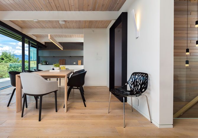
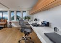
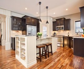
When entering the home your eyes seamlessly flow in through the kitchen a straight to the view. That’s the nice thing about a clean modern design, is that there are no distractions. No clutter to take away from the true value of the property and the function of the home. In fact, there is even added function, because many of the white walls are actually full height storage built right in. This smart design feature makes it easy to maintain a clean space even with a family.
How Does the Photography Help this Space?
You may think it’s easy to photograph a residence with such a clean modern design, but it has it’s own challenges.
For one, an open floor plan certainly feels nice when you are inside however it can become difficult when taking pictures. Because the farther away items in the photo will be pushed back by a wide angle lens, and a normal lens won’t deliver an expansive feel. Another typical problem with a wide angle would be that the ceiling and floor take up too much of the photo and the viewer can loose sight of the beauty of each room. So what I’ve done to maintain the feeling of being in a large open floor plan is this. I’ve continued to use a wide angle and simply placed the lens closer to the objects of interest and framed each space on its own. This keeps the space feeling large but without the flat and uninviting feeling that some photographers end up getting.
Secondly, it can be too easy to loose focus and let the eye wonder, especially in a clean modern design. Far too many photographers when shooting modern homes end up with toneless, two dimensional photos. I’ve solved this in two ways. First by strategically placing the camera to utilize the converging lines, and the placement of objects to lead the eye around the photo. Then by using strobes (high powered studio lights) to add depth for a three dimensional look and feel. This also makes for a more interesting photo, one where the inside and outside exposures are harmonious.
This project was shot for the purpose of both marketing and entering the Georgie Awards.
Designer: Gaile Guevara
Builder: Alair Homes Vancouver
Photographer’s contact page
Project details:
- Client: Alair Homes Vancouver
- Project Started: June 02, 2016
- Completed on: February 15, 2017
- Category: Architectural